Do you need to create a design for a bottle label? Take a look at these 7 examples created by Skillmill members – maybe some of the details you see will inspire your own work.
Keep three important tips in mind when working with bottle labels:
1) Product name should be clear and easy to recognize. Even the most beautiful design is of little value if it doesn’t stimulate brand recognition.
2) Keep the style consistent with the brand. Make sure to familiarize yourself with the company’s other products. Read up on the company values and keep their target market in mind.
3) Consider label size. It may sound obvious, but you’d be surprised at the number of designers who forget to consider the physical dimensions of their bottle. Know the bottle size accurately – down to the very millimeter. This way you can avoid having to redo a design after labels have already been paid for and printed.
Examples
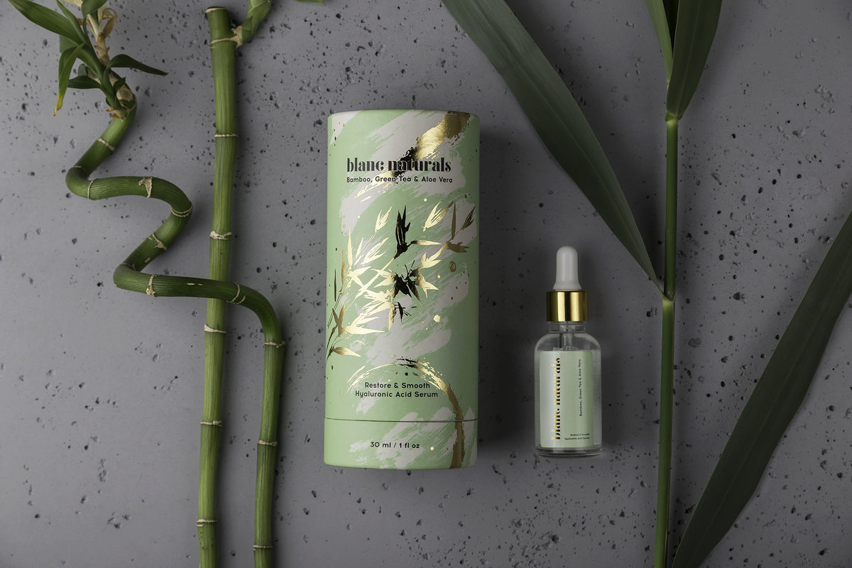
1. Blanc Naturals
An aesthetically pleasing cosmetic product design by Polish designers. The metallic elements let you know it’s a beauty product at first glance.
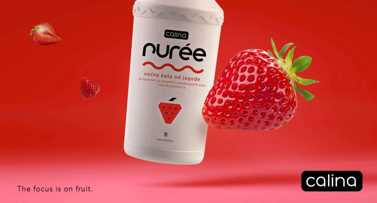
2. Calina Purée
This work by Serbian brand agency TREE is a label for a fruity, yoghurt-like drink. The white minimalism has a very modern look to it.
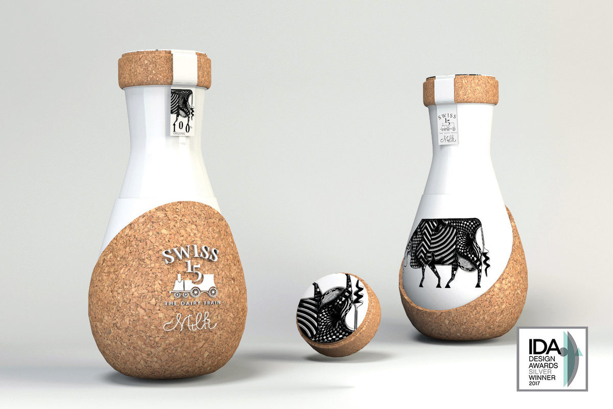
3. Swiss The Dairy Train
This packaging definitely catches your attention on the shelf. The award-winning Romanian agency opted to reinvent classical dairy packaging and elevate the symbol of the milk’s maker to an icon.
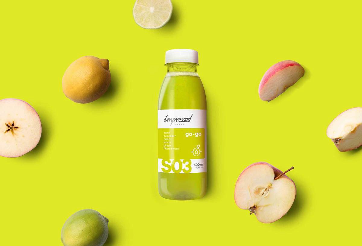
4. Impressed London
Designers for this London-based cold-pressed juice brand not only created this particular label, but also the brand’s logo. They told us about how the logo works on two levels:
1) as a hand-written inscription
2) as a signet ring, representing the company’s method of juice production
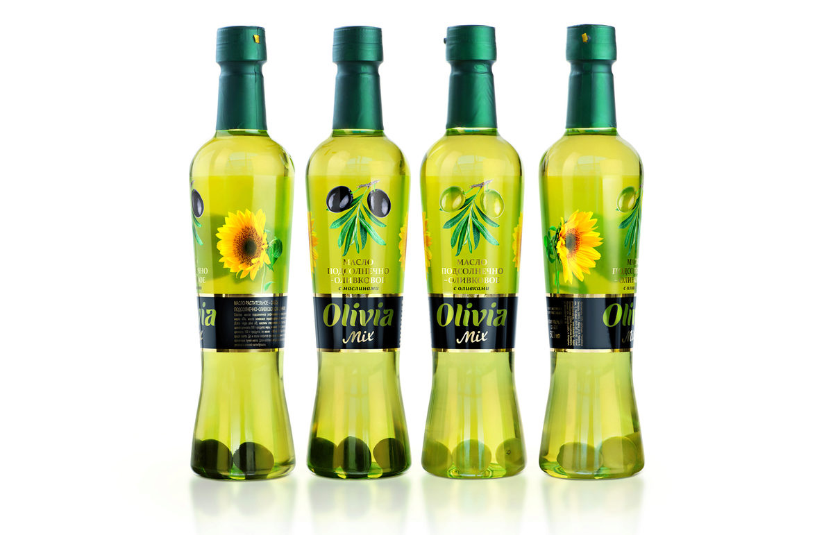
5. OLIVIA MIX – Sunflower and Olive Oil
The transparency of this label is contrasted by a black background that emphasizes the brand name. Remember Tip #1 about making the brand name clear?
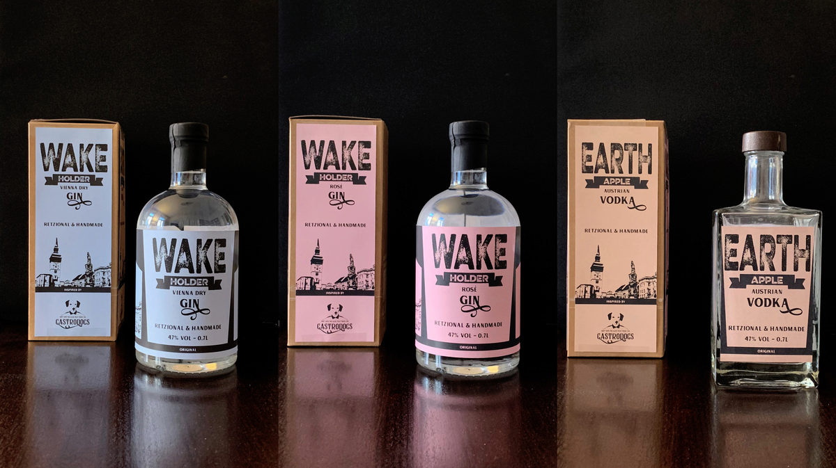
6. Wakeholder Austrian Spirits
Gustav Assem’s design conveys the traditional roots of gin. Although the company itself is quite young, they tie into the history of Dutch soldiers drinking “genever” during the Eighty Years’ War to increase bravery in the face of battle. Judge for yourself whether this design tells the tale.
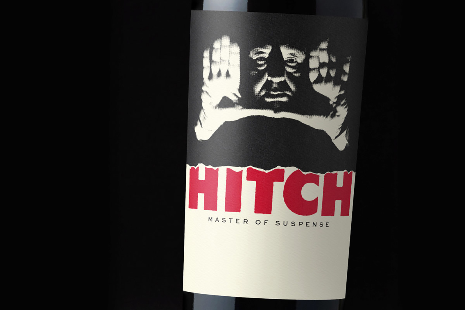
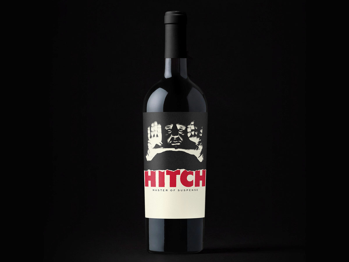
7. Our favorite: Hitch – Master of Suspense
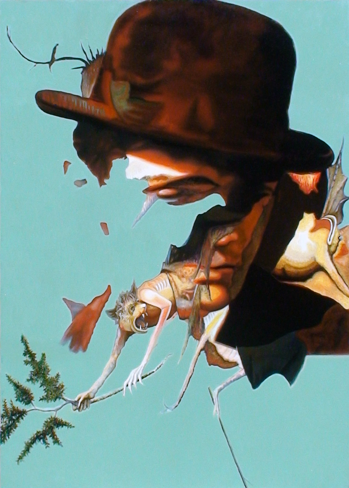
This label by Swedish drink label designer Christian Bjurinder scares us too much to not include it! Although it never went into production as an actual label, it deserves and eternal spotlight here!
We hope this short overview inspires you.
Tell us about your favorite in the comments below!
